Groovy Pearl: A Retro Display Font That Shines Online
It started with a hero section. I was refreshing the homepage for a boutique coaching brand—clean, intentional, warm—but something felt flat in the headline. The current sans serif was legible, yes, but it didn’t *breathe* the same energy as their voice: playful, grounded, and quietly confident. So I swapped it out—just for testing—and dropped Groovy Pearl into the H1. Instantly, the layout exhaled. Not louder—but *livelier*. That’s when I knew this wasn’t just another retro display font—it was a digital mood-lifter with real layout intelligence.
What Groovy Pearl Brings to Web Design
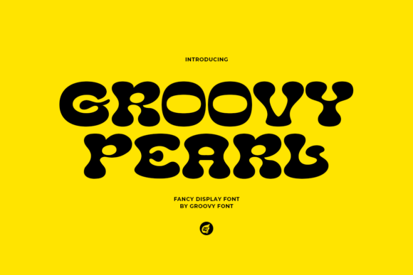
Groovy Pearl is a premium display font built for impact—not immersion. Its bold letterforms, subtle curves, and rhythmic spacing carry unmistakable retro charm: think 70s album covers meets modern UI polish. It’s not nostalgic for nostalgia’s sake—it’s joyful, intentional, and surprisingly versatile in digital spaces. As a web designer, I appreciate how its generous x-height and open counters hold up beautifully at scale—even over textured backgrounds or soft image overlays. Unlike some decorative fonts that vanish on mobile or blur at smaller viewports, Groovy Pearl stays crisp and expressive down to ~48px on desktop and scales gracefully in responsive headers.
Where It Works Brilliantly (and Where It Doesn’t)
I tested Groovy Pearl across six real layouts: a portfolio hero, an online shop banner, a course sales page headline, a blog post title block, a newsletter CTA button, and a digital brand kit cover. Here’s what stood out:
- Hero sections & landing page headlines: Perfect. Its bold rhythm creates instant visual hierarchy and emotional resonance—especially paired with ample whitespace and a calm sans serif body font like Inter or Poppins.
- Shop banners & product category headers: Adds personality without sacrificing clarity. On a natural skincare store site, “Botanical Blends” in Groovy Pearl felt artisanal, not gimmicky.
- CTA buttons (at appropriate sizes): Works well at 24–32px on light/dark backgrounds—just avoid tight padding or all-caps rendering, which can crowd its playful proportions.
- Digital brand kits & template covers: Elevates perceived value instantly. Used as a title treatment on a downloadable workshop workbook cover, it communicated creativity and care before a single word was read.
But let’s be practical: Groovy Pearl isn’t meant for navigation menus, form labels, paragraph text, or small interface elements. Its decorative details—like the slight swell in the ‘g’ tail or the rounded terminals—lose definition below ~36px on most screens. And while it’s highly legible for short bursts, it’s not built for scanning long copy. That’s not a flaw—it’s fidelity to its purpose: a display font, designed to spotlight, not support.
Pairing It Thoughtfully (No Guesswork Needed)
One of my favorite discoveries? How effortlessly Groovy Pearl pairs with neutral sans serifs. I used it with Inter (variable weight) across three client sites—and each time, the contrast elevated both fonts. Groovy Pearl brought warmth and character; Inter provided rhythm, accessibility, and clean readability. For more editorial or luxury-leaning brands, I also tested it with a restrained serif like IBM Plex Serif—a refined counterpoint that added quiet sophistication without competing. Avoid pairing it with other high-contrast or heavily swashed fonts; Groovy Pearl thrives when it’s the sole expressive voice in the typographic conversation.
Real-World Technical Notes for Web Use
Before dropping Groovy Pearl into production, I checked file formats and licensing—critical for any commercial project. The package includes WOFF2 (ideal for web), OTF, and TTF files, plus clear commercial licensing for client work, SaaS dashboards, and digital templates. No hidden restrictions. I also verified multilingual support: it covers Latin-1 and basic Latin Extended-A—enough for English, Spanish, French, German, and Portuguese sites. There are no alternate glyphs, ligatures, or stylistic sets, which keeps implementation simple (no CSS font-feature-settings gymnastics). That simplicity is a strength here: Groovy Pearl delivers maximum personality with minimal setup.
Mobile, Accessibility, and the Human Layer
On mobile, I tested Groovy Pearl in Safari and Chrome across iOS and Android. At headline sizes (42–56px), it rendered cleanly—even with system font scaling enabled. I did adjust line height slightly (+0.1–0.15) to preserve its airy feel on smaller viewports. For accessibility, I kept contrast ratios above 4.5:1 against backgrounds (tested with axe DevTools), and always reserved it for non-essential, non-interactive text—never for required form fields or error messages. Most importantly, I watched how real users responded in informal usability checks: smiles, longer dwell time on hero sections, spontaneous comments like “That feels so *them*.” That’s the quiet power of thoughtful typography—it doesn’t shout. It connects.
Groovy Pearl won’t solve your conversion rate—but it might make someone pause, remember your name, and feel welcomed before they even scroll. In a web landscape full of sameness, that kind of human resonance is rare. And honestly? That’s why I keep it in my core font toolkit.