Morp Caps: A Bold Display Font for Digital Brand Impact
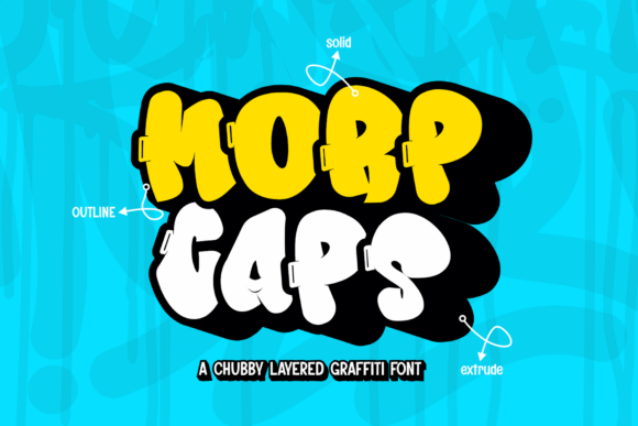
As a UI designer who ships landing pages, SaaS dashboards, and e-commerce experiences daily, I reach for display fonts not just for flair—but for function. Morp Caps stands out because it delivers unmistakable personality without sacrificing digital legibility or layout control. It’s a 3D layered graffiti font—affectionately chubby, unapologetically bold, and rooted in streetwise energy—but refined enough for professional web use.
This isn’t a script font or a delicate serif. Morp Caps is built for visibility: thick strokes, exaggerated curves, and intentional layering that creates depth even at small sizes on high-DPI screens. Its visual weight commands attention in hero sections, product banners, and CTA buttons—especially when paired with generous spacing and contrast-rich backgrounds. On mobile, it holds up best at 28px and above in headings; below that, it’s better reserved for logo lockups or decorative accents where context supports recognition.
Where Morp Caps Earns Its Place in Web Layouts
In real-world projects, Morp Caps thrives where brand tone needs to feel human, confident, and culturally grounded—not generic. Think of a creative agency’s portfolio site: using Morp Caps for the main headline (“We Build Unforgettable Digital Experiences”) instantly signals authenticity and craft. Or a boutique online store selling handmade streetwear—applying it to category banners like “Limited Drops” or “New Arrivals” reinforces exclusivity and attitude without needing extra illustration.
It works exceptionally well in conversion-focused zones:
- Landing page headers — Paired with tight line-height and ample letter-spacing, Morp Caps creates rhythm and pause, guiding the eye before users scroll.
- CTA buttons — At 20–24px on desktop (scaled responsively), its boldness improves tap target clarity on touch devices—especially over subtle gradients or image overlays.
- Course or membership sales pages — Using it for section titles like “What You’ll Master” or “Join the Crew” adds warmth and approachability next to clean sans-serif body text.
- Blog headers and social media graphics — When exported as SVG or used via @font-face, Morp Caps retains crisp edges across platforms—no pixelation on Instagram carousels or email banners.
Readability & Responsiveness: Practical Boundaries
Morp Caps isn’t meant for paragraphs—or even subheadings longer than five words. Its strength lies in brevity and impact. For readability on dark mode interfaces, ensure at least 4.5:1 contrast against background color (test with browser dev tools). On light backgrounds, avoid pure white—it reads cleaner against off-whites or soft greys. Over photography, use subtle text shadows or semi-opaque overlays to maintain legibility without flattening the font’s dimensional quality.
On mobile, avoid stacking multiple Morp Caps lines tightly. Instead, use it once per screen—typically the primary headline—and let supporting typography (a neutral sans like Inter or a warm serif like Literata) carry secondary information. This preserves hierarchy and prevents cognitive overload during quick scanning.
Smart Font Pairing for Digital Identity
Every great display font needs a reliable counterpart—and Morp Caps pairs beautifully with functional typefaces. For modern SaaS or app interfaces, pair it with a highly legible sans serif (e.g., Inter, Manrope, or IBM Plex Sans) for all UI labels, body copy, and navigation. The contrast between Morp Caps’ expressive weight and the sans’s clarity reinforces both brand voice and usability.
For editorial or coaching sites aiming for a more tactile, human feel, try pairing with a low-contrast serif like Cormorant Garamond or Playfair Display. That combination works especially well in testimonial sections, course syllabi, or founder bios—where Morp Caps introduces energy and the serif grounds credibility.
Licensing, Formats & Real-World Integration
Morp Caps is a premium font designed for commercial use—including websites, client projects, online stores, digital templates, and branded assets. Always verify licensing terms before embedding in production environments. Most reputable vendors provide WOFF2 files optimized for fast loading, CSS @font-face kits, and fallback strategies. Check whether the package includes stylistic alternates (like condensed or outlined versions), multilingual glyphs (Latin Extended-A support is common), and variable weight options—though Morp Caps shines strongest in its default bold weight.
When integrating into a design system, treat Morp Caps as a deliberate accent—not an all-purpose solution. Define clear usage rules: “Morp Caps is permitted only for H1s, primary CTAs, and logo text. Never for body copy, form fields, or data tables.” Consistency here builds trust: users begin to associate that distinctive texture with your brand’s confidence and creative rigor.
Whether you’re launching a new product, refreshing a portfolio, or designing a limited-edition drop page, Morp Caps gives you a rare advantage: the ability to communicate energy and authenticity at first glance—without compromising on web performance or accessibility fundamentals. It doesn’t try to be everything. It does one thing exceptionally well—and in digital design, that focused strength often makes all the difference.